The brief
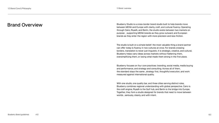
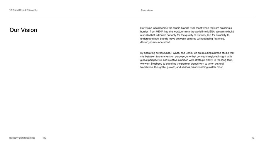
Blueberry is a studio. We work between Cairo, Riyadh and Berlin, helping brands move between the Middle East and Europe.
The studio needed an identity that could stand next to the work we make for clients. It had to be calm, clear and easy to use in both English and Arabic.
Brand core
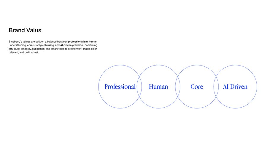
We started with who the studio is before any design. Four values guide the work: professional, human, core thinking and AI-driven.
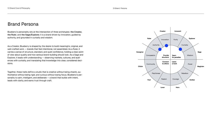
The personality mixes three types: the Creator, the Ruler and the Sage. Creative but not messy. Confident but not rigid. Curious but focused.
Logo system
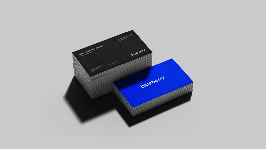
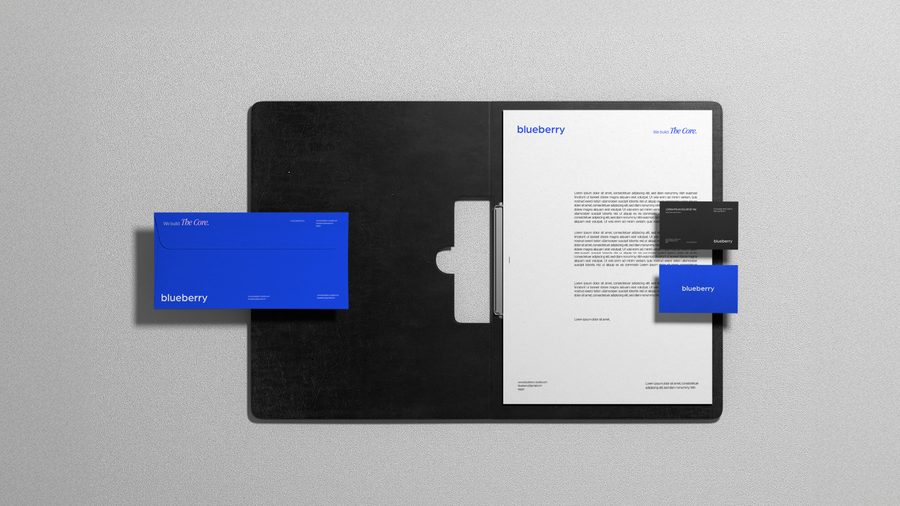
The logo is a simple lowercase wordmark. It should feel modern and friendly, and still look sure of itself.
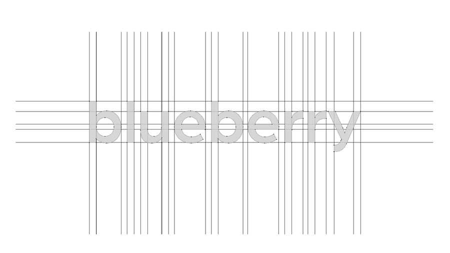
We built it on a grid and made an Arabic version to match it. There is also a short ‘bb’ mark for small spaces, plus clear rules for sizing, spacing and use.
Colour
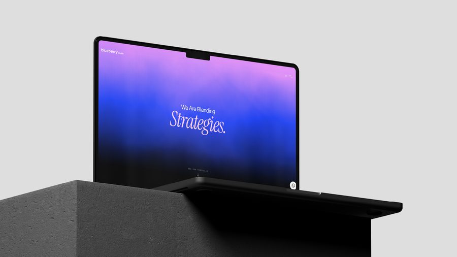
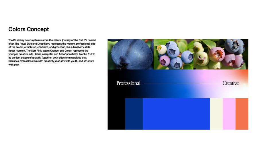
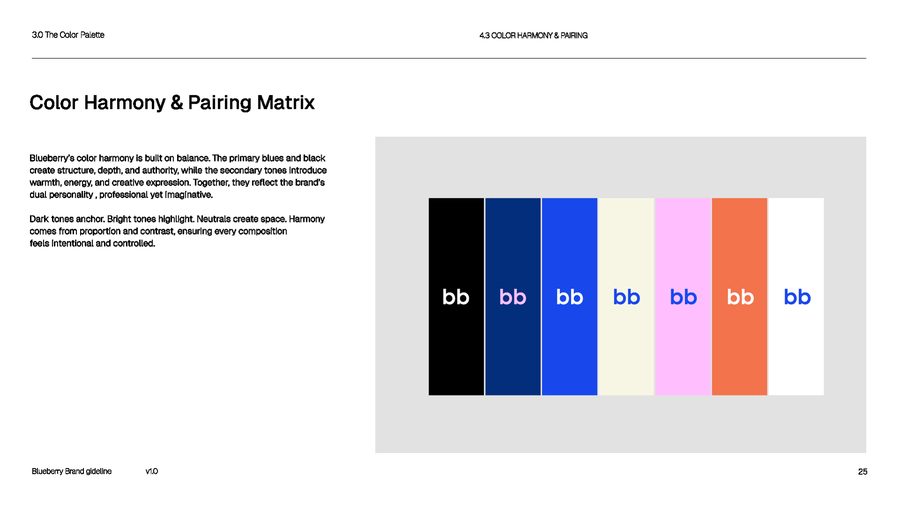
The colours follow the life of the fruit. Royal blue and deep navy are the ripe fruit: the serious, professional side.
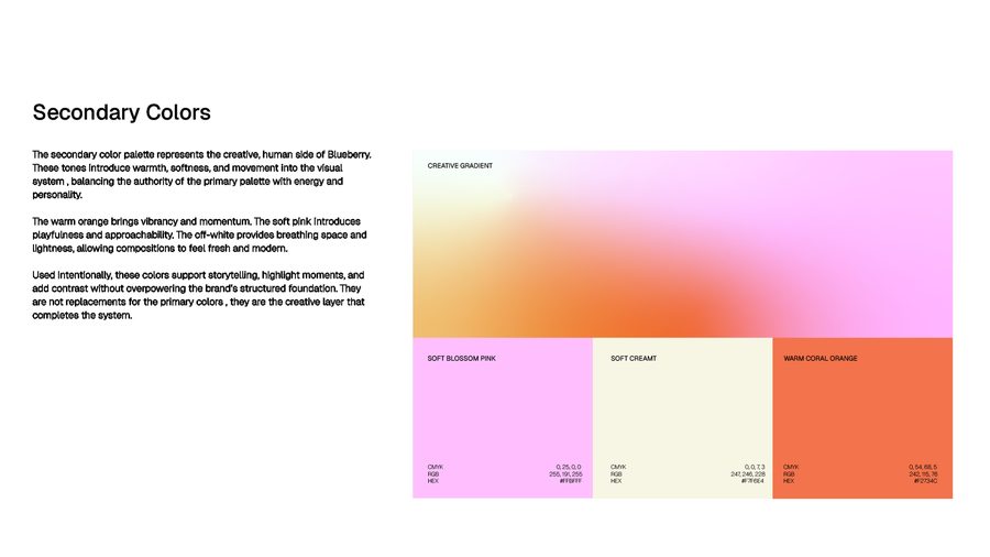
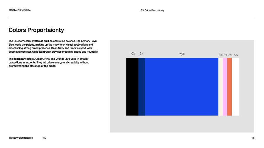
Soft pink, warm orange and cream are the young fruit: the creative side. Blue leads, and the warm colours are used in small amounts to add life.
Type and layout
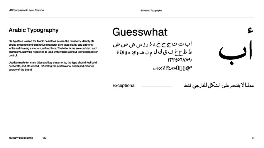
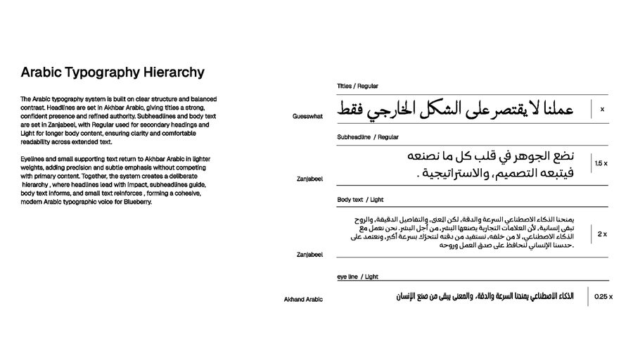
Three Latin typefaces: ITC Garamond for headlines, Geist for body text and JetBrains Mono for small details. For Arabic we use Guesswhat for headlines, Zanjabeel for text and Akhand Arabic for small lines.
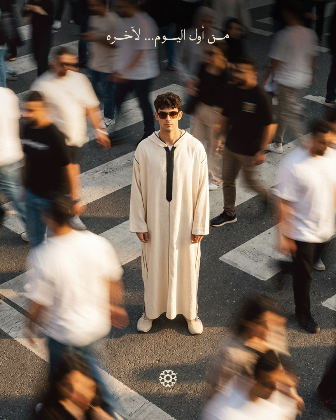
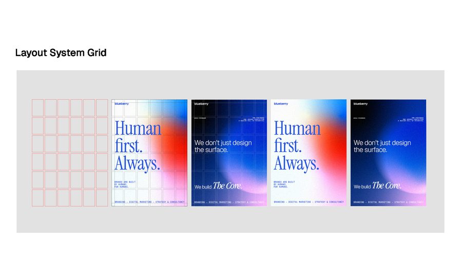
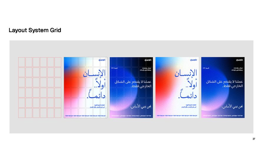
A shared grid keeps English and Arabic layouts equal. Neither language is an afterthought.
Imagery and art direction
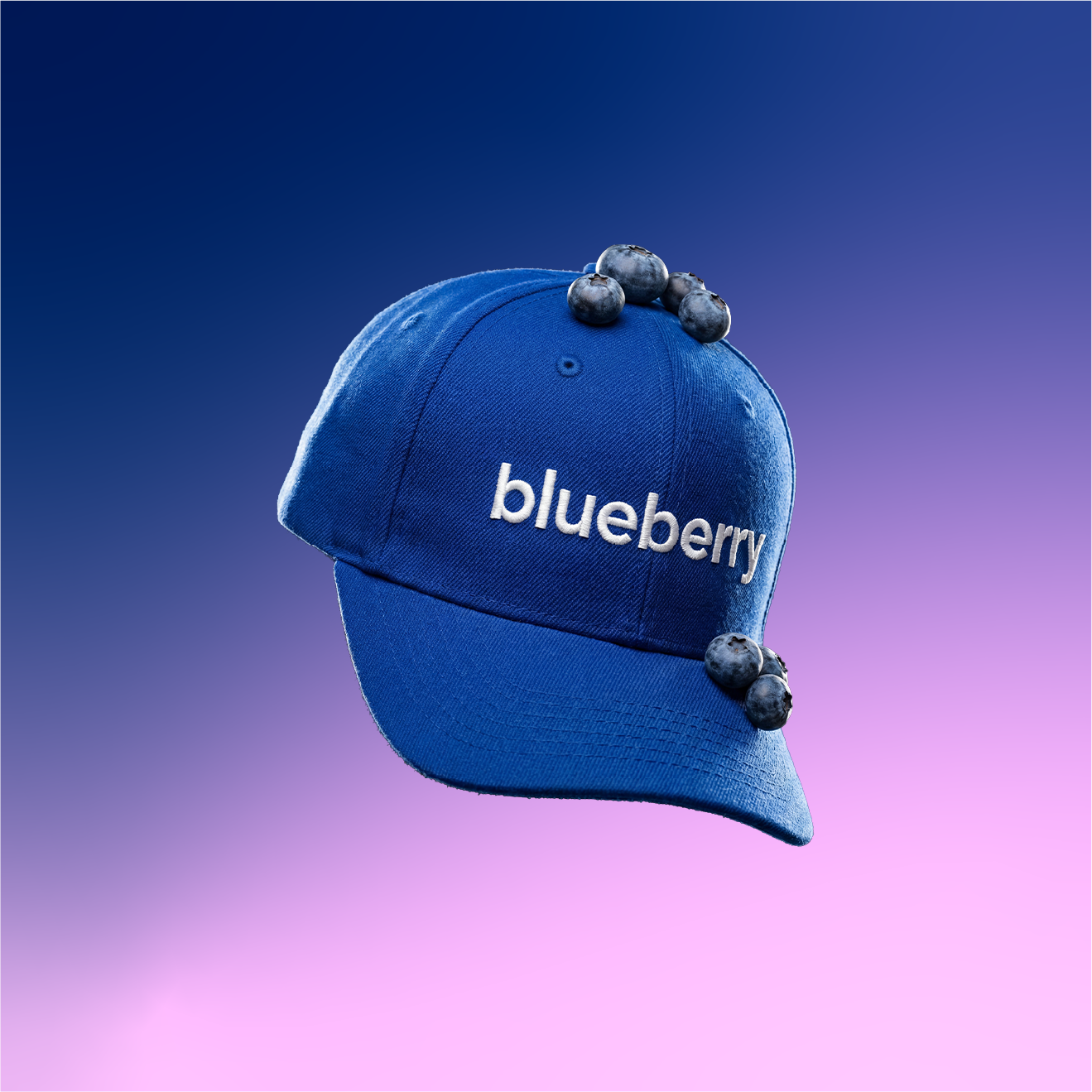
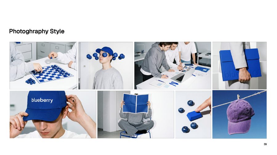
The photos are clean and bright, with a touch of humour. Real blueberries and blue objects show up in everyday scenes.
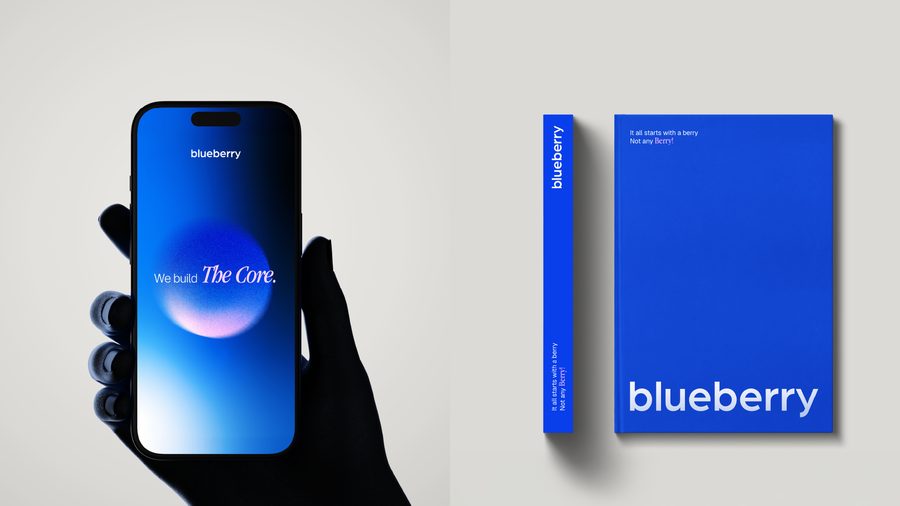
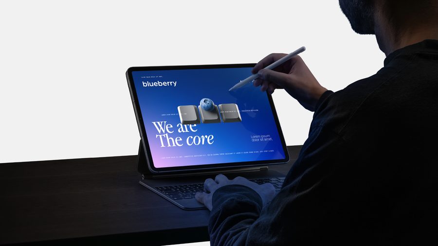
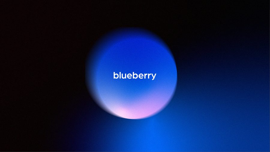
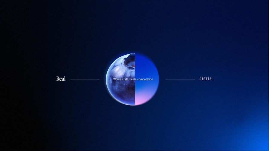
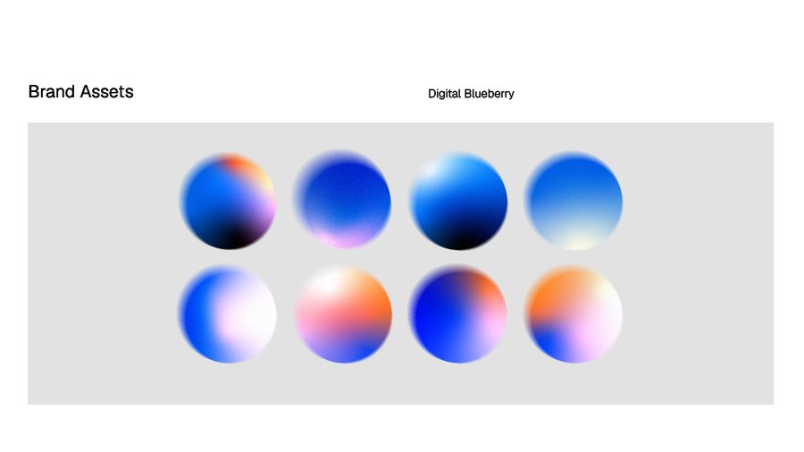
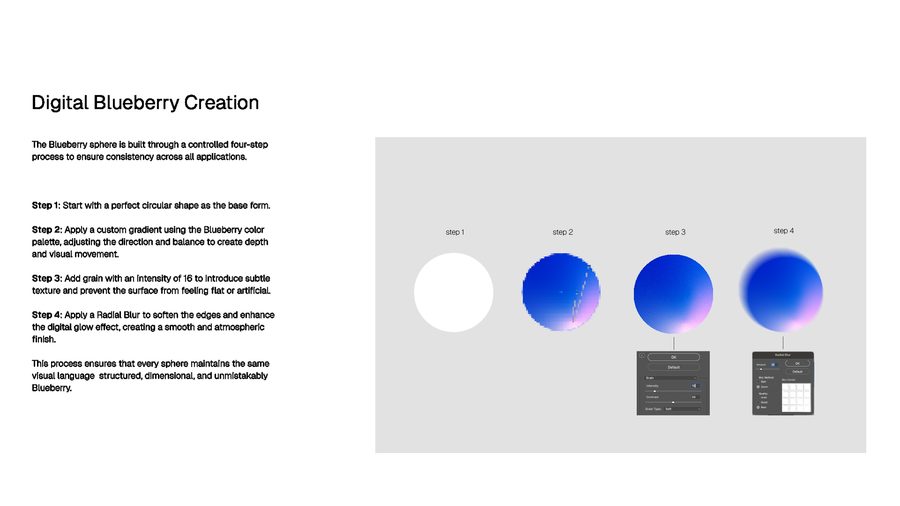
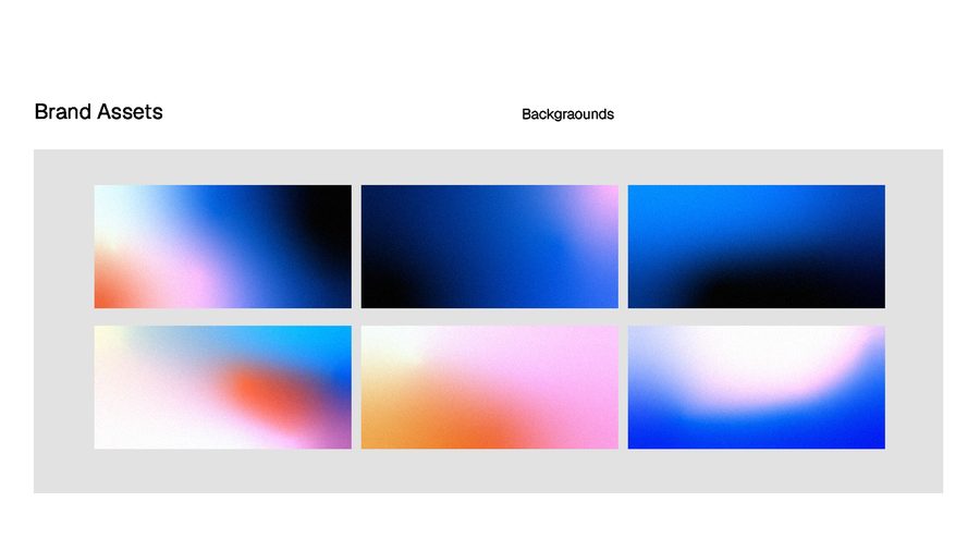
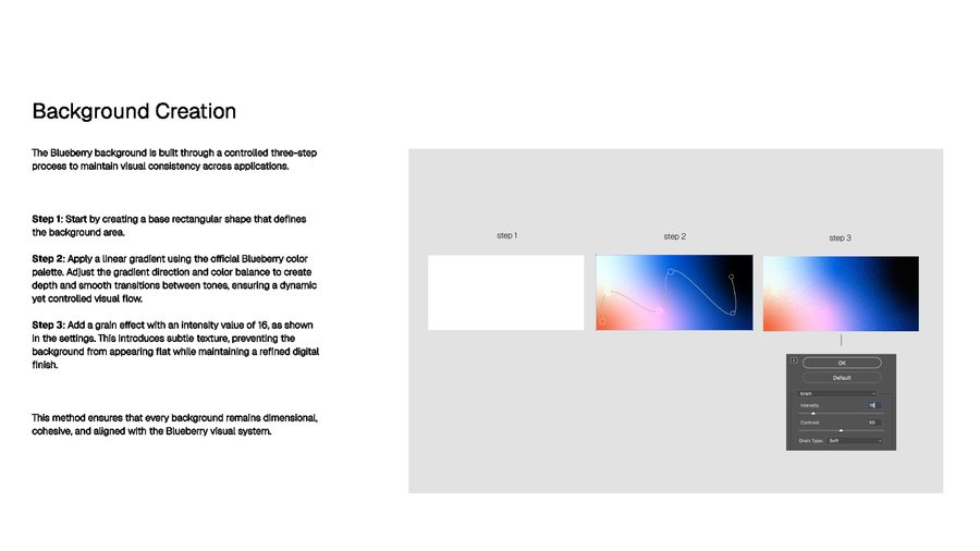
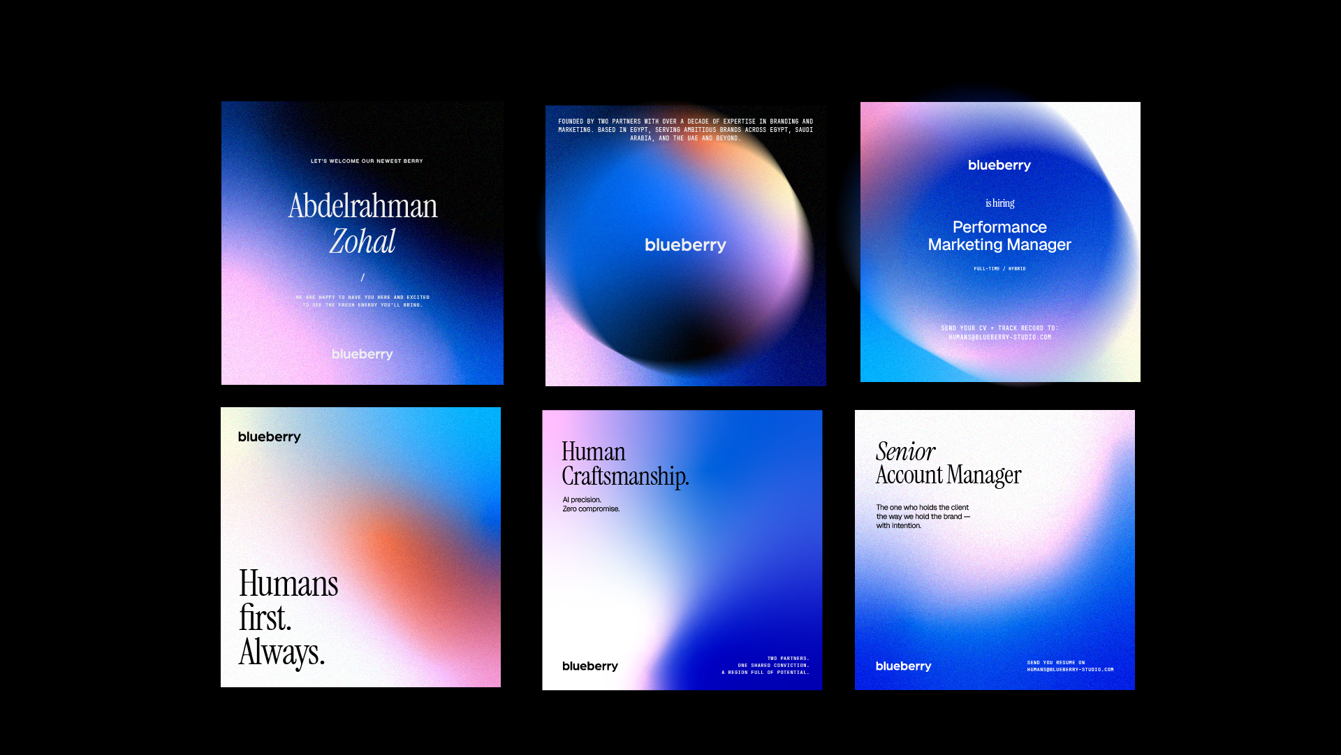
We also made a ‘digital blueberry’: a soft glowing sphere built from the brand colours. It works as a background, a frame for portraits and a quiet signature across the brand.
Digital
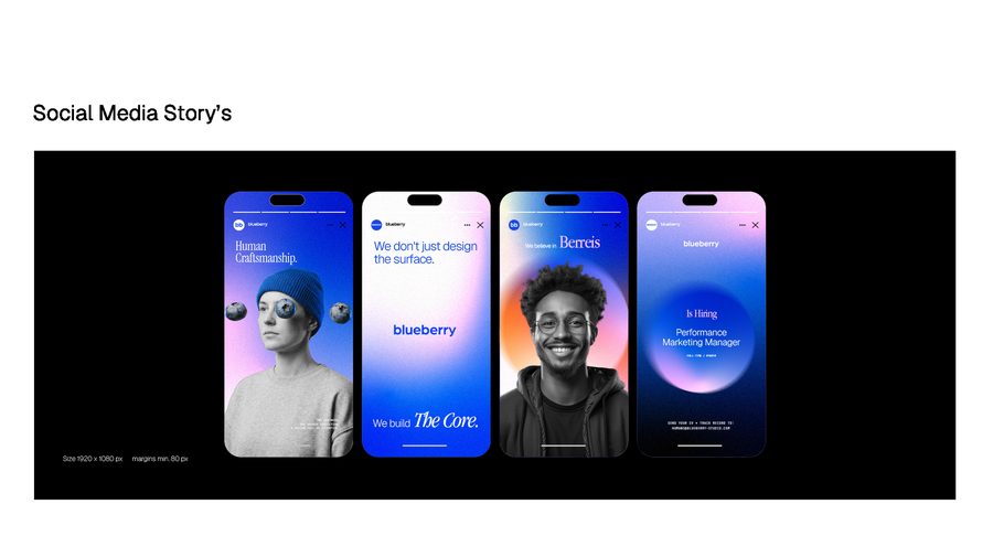
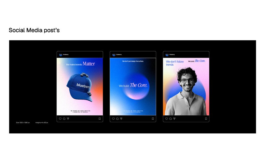
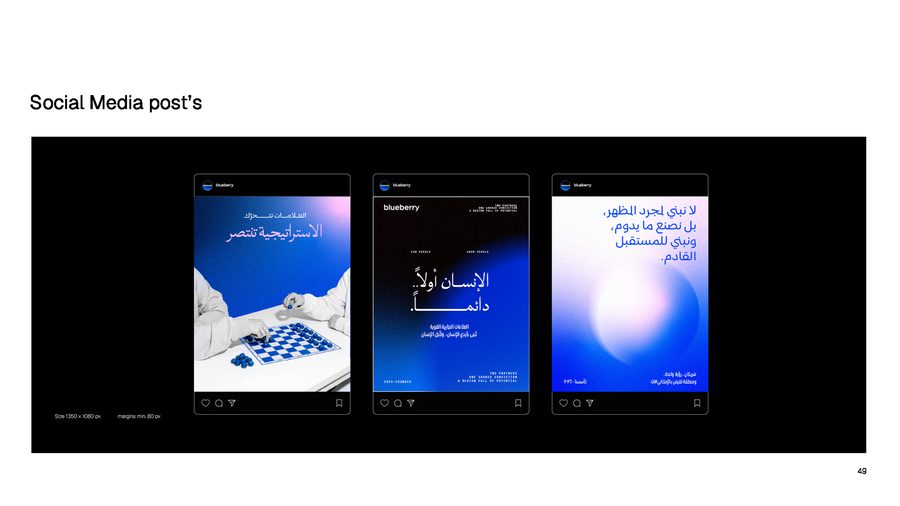
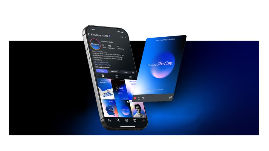
Most people meet the studio online first, so the system had to work on a phone screen. We designed social covers, stories, posts in both languages and an email signature.
Out in the world
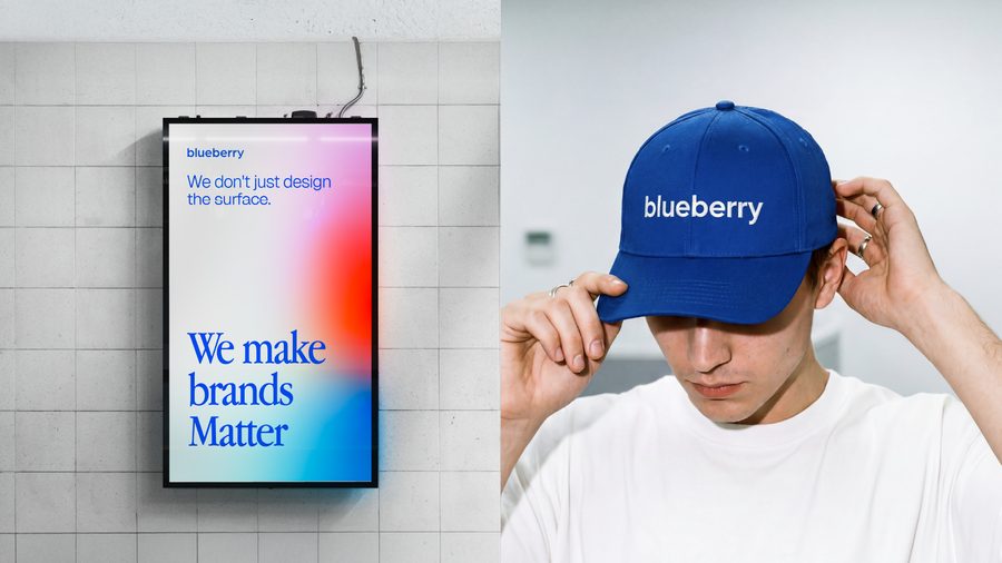
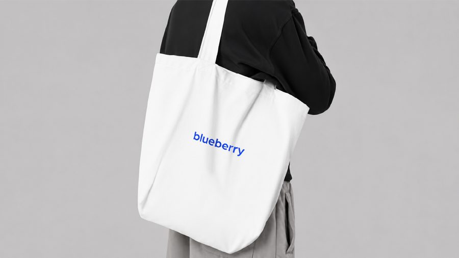
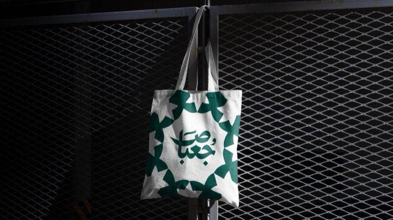
Finally, we tested the brand on real things: posters, caps, tote bags, team shirts, notebooks and screens. The goal was a brand that still feels like Blueberry when there is no logo in sight.